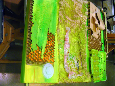


 On Monday I started working on Adaptive Reuse 2, the complementary opposite of Adaptive Reuse. While the original painting had a color scheme of red, orange, and blue, this one will be green, blue, and orange. Once again I am creating a piece for which the adage "less is more" does not apply. The more flotsam & jetsam I add, the better it looks.

No comments:
Post a Comment