Showing posts with label A Bitter Pill to Swallow. Show all posts

Wednesday, August 2, 2023

Book signing at the 2023 Black Women's Expo


On Sunday, August 6th, I'll be selling signed copies of my books at the 2023 Black Women's Expo at McCormick Place. Stop by Da Book Joint Literary Café from 2 - 4 p.m. if you want to pick up a paperback edition of A Bitter Pill to Swallow for the pre-pandemic price!


*Please remember to wear a mask!

Saturday, June 24, 2023

Book Cover Design Part 4: a new edition

*This is the 4th installment of a series. Here's Part 1Part 2, and Part 3.

Have you ever come up with an idea for a project years after completing it and wondered why it didn't come to you sooner? That's what happened to me with this redesigned concept for my book cover for A Bitter Pill to Swallow. I can't even blame it on not getting any feedback from other people. In 2015 I showed my penultimate drafts to a friend who's a professional graphic designer and not 1 but 2 art critique groups. Not until this year did I realize that there was a good way to put all my cover design elements on a single cover. If you recall, my original design involved 4 variant covers.

Let's go back to where it all started, a simple sketch I made while on my lunch break:


I had considered combining all 4 panels into a single book cover, kind of like this:


But there was one problem: the character in the bottom left panel. His presence on the cover would be a spoiler, kind of like if Bruno appeared front and center on the poster for Encanto. I guess that's why I never pursued that concept early on. Instead, I decided to give each character their own variant cover with the pills in the background for branding, in addition to a cover design only featuring pills. 

 
But even after all that work, I knew as an artist that there was no one right answer, just a myriad of other ways I could illustrate my covers, and that inspiration could strike at any time. The thought of reconfiguring my cover occurred to me once again when I had to put out a new edition earlier this year after increased paper prices and changes at a major book distributor left me with no choice. That design is basically the same as the old cover, with the addition of my award sticker. Just the act of opening up the file to make those small updates got me thinking about what else I could do. I knew I could do more,  but at the same time, I wasn't in the mood to come up with an entirely new concept. Why not use what I already made instead of reinventing the wheel?

After months of tinkering, this is what I came up with:


I'm so pleased to have 3 of my main characters together on the cover and still have the space for my award sticker and a quote from a blurb by a well-known author. I call this version the anniversary edition and am making my big announcement about it today because June 24th, 1993 was the day I began writing the short story that would grow into my novel. It certainly has come a long way from its humble beginnings in purple ink inside a 14-year-old girl's pink notebook.


This new edition is available online and through special order though most bookstores. The ISBN is 9798211153196. If you've read A Bitter Pill to Swallow and liked it, I'd greatly appreciate it if you could take a little time to rate it on IndieBoundBarnes & NobleApple Books Google Play StoreAmazon, or Goodreads if you haven't done so already. And if you haven't read it, I hope that the new cover might get you interested.


Tuesday, January 31, 2023

Blame it on inflation, I guess

Despite my best efforts and intentions, I had to increase the prices of the print editions of A Bitter Pill to Swallow this year. When I released it in 2016, charging $10 or less for my book was a point of pride. I wanted teenagers to be able to afford it. Unfortunately, thanks to inflation and a change in a major book distributor's policy around wholesale discounts, I can't charge $9.99 anymore, at least not for online bookstores. Rather than sell books with a completely unattainable suggested retail price, I decided to make a new cover without a price on it. (Which is actually a controversial choice that goes against typical publishing conventions.)


ISBN 9798211582866


Though I am sad that I had to make these changes, at least the new cover can highlight my 2016 Book of the Year Award from the Chicago Writers Association. The new bookstore edition is a 6"x9" 254 page paperback. The original paperback was 5"x8" and 330 pages. Changing the paper size allows me to charge a little less. For now, the suggested retail price is $16.95. I am hoping that I won't have to increase my price anytime soon. My new goal is to keep it under $20.

If you want a signed copy of the book, I am still selling them on Etsy, though I had to raise that price by $5. Variant hardcovers are still available in the Blurb bookstore. At least I didn't have to raise the price on the ebook edition. It's still $3.99 and can be found in all the major ebookstores you've heard of, and some you may not have heard of before.

If you want to special order it from your local independent bookstore or encourage your local library to stock it, tell them the ISBN is 9798211582866.


Wednesday, January 20, 2021

A Bitter Pill to Swallow, 5 years later

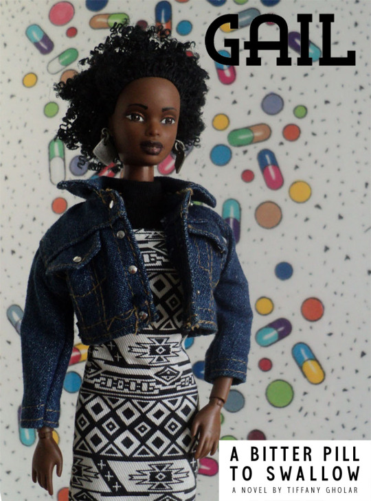
As I wrote in my art book/memoir, The Sum of Its Parts, 2016 is a year that will live on in infamy, though at the beginning of the year, I was feeling pretty optimistic because that was the year I published the YA novel I had worked on for many years, A Bitter Pill to Swallow. Five years ago today, I uploaded the final version of my book to be published after a long and stressful process that involved numerous rejections and disappointments. In the months leading up to publication, I tried to stay hopeful, but all around there were signs that the political situation in the United States was becoming more and more dire. As the months leading up to the election passed, the horrible man who would eventually become our horrible president was beginning to take up all the space in the discourse about just about everything, it seemed. And I was trying to promote my debut novel in spite of him. 


Those worlds collided March 11th, which was both the day of my opening reception/book signing and also the day Chicagoans ran a certain candidate's hate rally out of town. (If anyone missed the reception because they were at the protest, I completely support that, by the way.) Since this is inauguration day, I can't help but think about this. And sometimes I also wonder if things would have been different had I published at a time when people's attention wasn't so consumed by the election. 

Still, I am grateful that I was able to find bloggers who were enthusiastic about reviewing my book, and that I won a 2016 Chicago Writers Association's Book of the Year award for it as well. And 2016 was also the year that the Book Expo of America was at McCormick place, so I had the opportunity to have my book on display in one of the booths and also attend the expo and network there. Publishing my book myself opened up opportunities to speak on and moderate panels and meet a community of authors and booksellers I would never have met before. Illustrating my own book covers led to illustration projects for other authors, and I have been able to parlay my book layout experience into projects as well.

I also think that the political turmoil of this era led to more discussions about diversity in publishing. Though it still doesn't reflect the diversity of the population, the roster of books published about African-American teens has increased since 2016. And I would also like to mention that though it helped launch and support new traditionally published authors, I felt like the movement for diverse books left independent authors on the sidelines.


At the time that I was working on my book cover designs in the previous year, there weren't many Black characters on YA book covers. That's changed a lot now, and I'd like to think that I was at the forefront of that change.


Five years later, there are still a few milestones I had hoped to reach but still haven't yet. Hopefully one day I will finally be able to afford to record an audiobook edition. And I still don't have my book in as many libraries as I would like. In fact, one of my goals last year was to get a booth at the American Library Association's annual conference because it was supposed to be here in Chicago, but was canceled due to the pandemic. But in spite of these things, I'm glad I published my book when I did because I'm not sure how well I would have been able to concentrate on writing it had I attempted to do so during the past four tumultuous years. And though one reviewer described my antagonists as "cartoonish," perhaps now they might seem more realistic after we have have had to endure four years of a cartoon villain in the White House.

Though my book is now five years old—ancient by industry standards, I know—because it's set in the 1990s, in some ways it was always "old" to begin with. But it's still new to all the readers who don't know about it yet, and that gives me a reason to keep promoting it. So what that means is that I'm still open to doing interviews about it and giving free ebook copies to reviewers, and of course, virtual classroom visits.


Here are all my posts about A Bitter Pill to Swallow:


A nice place to write a story

#WeNeedDiverseBooks 

Judging books by their covers and learning from them

Book Cover Design, Part 2

The Other Doll Project, Part 1

Book Cover Design Part 3 - Back Covers Need Love, Too

My new stores for A Bitter Pill to Swallow


And here are the podcast interviews I did:

Open Ended, Episode 74, "Petty or Not"

Shelf Addiction, Episode 35, "Diversity in YA with Featured Author Tiffany Gholar"


The official site for A Bitter Pill to Swallow is here:

http://www.abitterpill2swallow.com/


If you're looking for something to read, check it out.


Wednesday, July 15, 2020

Now available: face masks with my art on them

So I decided to get into the mask-making business after all, but without having to sew anything. I am now selling them in 3 of my online print-on-demand stores. They are available in different sizes and you can customize them.


These are the Zazzle masks.


And these masks on Society6 feature the cover art for A Bitter Pill to Swallow. Stay safe out there!

Tuesday, February 2, 2016

My new stores for A Bitter Pill to Swallow

I've been keeping it under wraps for several months now, but I have two new stores, one on Zazzle and one on Society6. I created all kinds of products with my cover art for A Bitter Pill to Swallow. Whether you're nostalgic for the early 90s or weren't around to remember them, if you like my cover art, you'll enjoy them.

It's funny, I used to sell sunglasses at Nordstrom, and now I'm designing them!


My favorite pieces to design were the allover print shirts. It was pretty easy to make them on the Zazzle website.


And it's pretty amazing what I was able to do with my images once I uploaded them to Society6. 


Now there is even a Bitter Pill shower curtain.


Of course, my main reason for creating the Society6 store was to sell prints of my cover art designs.


If you like what you see here, please visit both sites so you can see everything I'm selling. Both Society6 and Zazzle offer coupon codes on a regular basis, so keep an eye out for them. I will give you the links again so you don't have to scroll up:

Thursday, January 21, 2016

Book Cover Design Part 3 - Back Covers Need Love, Too

In Part 1 of my series on the process behind the book cover design of my new novel, I wrote about the book cover designs that inspired me. Then in Part 2 I wrote about special covers I designed featuring my main characters' faces. Now for the final installment, I'm going to share a little about the process of designing the back cover.

First, it's kind of funny (ironic in an Alanis Morissette kind of way?) that with every milestone in the development of A Bitter Pill to Swallow I seemed to have contracted an ailment I needed some kind of pills for. It began with querying so relentlessly that my cold turned into pneumonia (azithromycin). Then when I finished my character illustrations I got tonsilitis (amoxicillin). When I finished my final draft, I had a cold (Benadry + Advil since that new cold medication doesn't work for me). Despite my bad cold, or maybe because of it, I stayed home and rung in the new year designing back covers.

What I realized when designing my back covers is that if it's done right, a back cover has all the information you need for all the other materials (like flyers and sell sheets) you need to market your book. The biggest challenge for me was working around the ISBN barcode which could not be moved in the Blurb Bookwright layout software when deciding where to put everything on the back covers of my paperbacks. Eventually I figured it out.

The fonts I used for my back cover copy come from the Noyh family. A few months ago they were on sale on MyFonts.com and I got a really good deal on them. Now the font family is selling for $160. What I like about Noyh is that it's still very legible at smaller sizes, making it ideal for small spaces like the back of a pocket-sized paperback. The font I used for my headlines is the same one I chose for the title, Rhea.  I chose Modum for my hardcover jacket text. Originally I had planned to use it for the body of the novel, but after using it in my advanced reader copies I didn't like the way it looked. Then I fell in love with Eureka, and chose to use that for the body of the novel instead. (Well, most of it. If you get a hard copy of the book or the PDF, you'll see what I mean.)

I took my author photo myself. The sweater I wore for it is a Michael Simon my mom bought for me freshman year of high school, fitting for the era of the story. And my colorful crochet earrings are from Etsy. Centering my photo below the synopsis and above the barcode area gave me just enough room for the author blurbs and my bio on either side of them.


Each cover design has a different blurb.


The hardcover editions gave me a little more room for my text and images.


I put the character blurb inside the front jacket flap of each hardcover.


And I put the author blurbs on the back. My author bio is in the back flap of each book jacket. 

I made an error when editing my author bio and ended up having to create a different edition as a result. The typo turned out to be fortuitous because during the time I was waiting to hear back from Blurb about removing the book with the mistake from distribution, I came up with ideas for last minute edits that made for an even better story. Just when I thought I was finished, my brain started acting like Lieutenant Columbo


It's amazing how adding a few sentences here and there can make a story that much better. Now that I'm all finished, it's time to move on to the next phase: marketing. I hope this series has gotten you interested in reading A Bitter Pill to Swallow. By the way, I am giving away free ebook copies to readers who promise to rate or review it on sites like Amazon, Goodreads, and Barnes and Noble. Feel free to email me if you're interested!

Friday, December 4, 2015

The Other Doll Project, Part 1

So I made my own dolls. Well, kind of. I didn't make them from scratch. I repainted some fashion doll heads and put them on the bodies of different dolls. And I dressed them in various outfits and took some pictures.  The purpose of this odd little project is to promote the novel I'm publishing soon, A Bitter Pill to Swallow. These are my characters.


And here they are with some quotes from the story.


I have been working on these dolls since the fall of 2013.  I always had an idea of what my characters looked like, and being a visual person, even drew illustrations of them. The dolls are like my drawings come to life. Creating them helped to inform my writing process, as well as my cover design. Look closely and you'll notice that Janina's doll dresses are referenced in the patchwork of the jacket she wears on her cover.

The whole project was quite involved. But this is only half of it! Part 2 of this post is coming soon. In the meantime, follow me on Tumblr to see more of the art I've created to go with my story. I plan to post one image per day until my book is published.

Tuesday, December 1, 2015

Book Cover Design, Part 2

In my previous post about my book cover design, I shared my process for creating the 5" x  8" paperback cover of my forthcoming novel. But that's not all I've been doing. I also decided to create alternate cover designs for different markets. I was always fond of the cover of Nick Hornby's short story anthology, Speaking With The Angel, and I think it was unconsciously an influence on my concept.


I sketched out a rough draft one day while I was on my break and having lunch at Subway.


Later I refined my drawings and colored them in using markers and colored pencils, a technique I learned in design school from Ryan Kapp.


And here are my covers now.  Below each one is the blurb that will accompany it.


Devante's life has been changed forever by tragedy, and he can't deal with it. He can't sleep without having nightmares and feels like his life isn't worth living anymore. His parents send him to a special boarding school for kids with emotional problems. There he meets Janina, who makes him feel less alone in the world. But will Devante's traumatic memories and Janina's strict parents come between them? Set at the end of a cold Chicago winter in 1994, A Bitter Pill to Swallow is the story of a boy and girl whose lives intersect in unexpected ways.

Janina isn't sure she'll ever have a normal life or a boyfriend. This is the fourth year she's spent at a special boarding school for kids with emotional problems. And then she meets Devante, the cute new boy who refuses to speak. For the first time, she feels like she has found someone her age she can relate to. But will Janina's strict parents and Devante's traumatic memories get in the way? Set at the end of a cold Chicago winter in 1994, A Bitter Pill to Swallow is the story of a girl and boy whose lives intersect in unexpected ways.


Dr. Gail Thomas fears her career may end before it even begins. She has just done the unthinkable: quit her medical residency. The facility where she had been working was a cruel place. Incompetent staff constantly mistreated the children and teenagers in their care. Frustrated and on the verge of giving up on her dreams, Gail goes to  work at a therapeutic boarding school run by an idealistic psychiatrist. Her new boss’s unusual methods and troubled young patients put her skills to the test. Set at the end of a cold Chicago winter in 1994, A Bitter Pill to Swallow is the story of a determined young woman claiming a place for herself in her profession and unraveling a medical mystery.


The beauty of self-publishing is in the creative control I get. It's nice to have the freedom of self-expression. It's nice not to have to ask for permission. In some ways I feel as though creating book covers with Black characters on them is a revolutionary act. There are very few novels in the Young Adult genre that have Black teenagers on them. When they do appear, they are often in silhouette.

When I showed my cover designs to some other artists to get feedback, one of them said that nobody wants to buy a book with a Black girl on the cover. Nobody? Really?

https://twitter.com/djolder/status/605083061659824129/photo/1


Tell that to the enthusiastic fans of Daniel José Older's new YA Novel Shadowshaper, which features a captivating Afro-Latina protagonist.


Or to Naomi Jackson, author of The Star Side of Bird Hill.


I decided not to do what I had all too often done before, to try so hard to make my work "universal" and "relatable" that I exclude myself from it. And I am happy with the result.

The three special edition covers will be a feature of the hardcover version. And there is more book-related art to come, so come back in a few days to see my next blog post about it. Or visit my new Tumblr.

Thursday, July 23, 2015

Judging books by their covers and learning from them

About a year ago, I shared a little bit of the artwork I've created around a project I've been keeping under wraps, my YA novel. Now I'm going to let you in on a related top secret project I've been working on: the design for its cover. I do have experience designing my art book covers, though it was pretty easy. All I had to do was choose a good detail photo and a good font. I actually ended up using the same font on all three. Branding? Laziness? Trying to save money on fancy fonts? I suppose the decision to go with Miso was the result of all 3 things.

But for my latest cover, the process was very different. This is a work of fiction. There were no pre-existing images for me to work with. I had to create them from scratch. But before that, I studied book covers. Rather than make a Pinterest board, I decided to create a folder in the cloud where I saved pictures of covers I liked. I looked at a variety of genres from many time periods, not just contemporary ones. Here are some of my favorites.


These are just a few of the covers I've added so far. If you want to see the rest of them, click here.

Along the way I found some interesting similarities between some of the covers I like. By chance, the Lois Duncan reissued paperback cover ended up next to one for a book about artist Man Ray, and I noticed that the women on the covers look alike.


The series of reprinted books by Lizzie Skurnick looks great, by the way. I love the vintage feel.


I was also impressed by these series. Great branding. It makes you want to collect them.


This lovely image is from readthebloodybook.com

I also noticed how some covers pay homage to designs that came before them, like this book cover that references an album cover.


Or this one that references an iconic poster.


Early on in the process, I decided to use an image that I would have to get permission to incorporate into my design. It's by Charles Eames.


Then, I changed my mind after coming across a graphic I liked on some wrapping paper. It feels much more late 80's/early 90's, which fits with the era in which my novel is set.


I used it as an inspiration for my own design.


If the cover design has you wondering what my story is about (and I hope it does!) here is the blurb:

On the edge of the Chicago medical district, the Harrison School for Exceptional Youth looks like a castle in a snow globe. Janina has been there since she was ten years old, and now she's fourteen. She feels so safe inside its walls that she's afraid to leave.

Devante's parents bring him there after 
a tragedy leaves him depressed and suicidal.  Even though he's in a different place, he can't escape the memories that come flooding back when he least expects them.

Dr. Gail Thomas comes to work there after quitting 
her medical residency. Frustrated and on the verge of giving up on her dreams, she sees becoming a counselor as her last chance to put her skills to the test.

When he founded the school, Dr. Lutkin designed its unique environment to be a place that would change the students' lives. He works hard as 
the keeper of other people's secrets, though he never shares any of his own. But everything changes late in the winter of 1994 when these four characters' lives intersect in unexpected ways.  None of them will ever be the same.

Stay tuned for the next installment, in which I will reveal the special edition covers I am working on for hardcover.