Showing posts with label drawing. Show all posts

Monday, January 30, 2023

The hand of the artist


I drew these hands when I was 17. You know what can't draw hands like this? AI


Whether you're self-taught or have an art degree, whether you work from blueprints or you improvise, whether your art is representational, abstract, or conceptual, traditional or contemporary, commercial or esoteric, stylized or realistic, digital or analog, one thing I think we can all agree on as artists is that there is something deeply unsettling about AI "art." 

The course of AI art was charted years ago, a road that was excavated and paved by an internet culture in which derivative work became more dominant than original work, a dismissiveness towards artists that has resulted in sites where projects went to the lowest bidders, an environment where asking artists to work for exposure is commonplace, a social media milieu where everyone is expected to be a brand and churn out infinite content, and a mindset that art and design practitioners are frivolous fools who should have learned to code instead. 

Innovation is only for tech. The creativity that reaps financial rewards is riding on the coattails of everything that came before it, leading to prequels, sequels, re-imaginings, remakes and retellings. Online, there is an oversaturation of imagery that is secondary to the purpose of a post and pictures are relegated to content. Art is merely decorative and ancillary. It's only there to serve the needs of our data-obsessed world. Celebrities are publishing picture books not out of a genuine desire to entertain children, but to extend their brands. Instead of developing your skills and craft into a business that you can run for the rest of your life, you're supposed to create and sell a series of businesses to venture capitalists. This is not a hospitable climate for the emergence of new artists.

Though the world of art galleries can be notoriously exclusive, most of the artists I've come to know  are quite receptive to other artists and welcome their fellowship. Our objection to AI imagery is not motivated by a desire to gatekeep who can call themselves artists, but a protective measure, keeping out the interlopers who come in the name of disruption to eviscerate everything we hold dear. The intruders will never understand the satisfaction of mastering a skill, or the magic of making something from nothing.


They tell us to cope and seethe, to adapt or die. This is the future. It's inevitable. There's nothing we can do to prevent our obsolescence. Disruption has come for us and we're unhinged to protest against it. Our resistance is futile.

There's something about the smug way they say these things that infuriates me to no end. I hate it when people who know nothing about my work (because they never bothered so much as looking at it once) try to tell me what kind of art I should make. How can I not feel resentful of an artificial imagination taking over when I've so rarely gotten paid to use mine? 

The disrupters say it's just a tool and compare it to photography, but photography is an artistic medium in itself and still relies on the photographer to compose the shot, decide when to shoot, select which image to print and how the image will be displayed. The camera is a means to an end. Comparing it to collage and found object art also doesn't work because making such art still takes planning, time, and effort. And even in digital art, images can still be imbued with a sense of the sentience, corporeality, spirit, free will, hopes and dreams of the living human being who made it.

The disrupters accuse us of not caring about other workers who lost their jobs to automation, as if we haven't spoken up before, as if many of us aren't also employed in such work for survival. Imagine having your source of income replaced by AI and then your dream job, too!

I keep thinking about AI "art" when I consider the interior design industry's current obsession with computer-generated 3D renderings, especially Revit. There are some parallels and some differences. As someone who graduated before Revit was part of the curriculum, the question that keeps coming up for me is this:

What happens when we emphasize technical proficiency over creative vision?

There might be a cautionary tale in there somewhere. Things have gotten to the point where if you don't know how to use a prohibitively expensive program with a steep learning curve, you are stuck working at a furniture store. I would hate for there to be a similar development in fine art. I'm not suggesting that designers should all go back to drafting and rendering by hand, or that artists should stop using computers, tablets, digital cameras, scanners, and smartphones. The use of technology doesn't have to be an all-or nothing proposition. What I am opposed to is technology usurping humanity.

On LinkedIn, author Brandeis Marshall posted that tech "fills their void of purpose" with AI. The purpose of computers, and machines in general, had once been to make our lives easier. They were supposed to do the tasks we found unpleasant and tedious in a more efficient way. Since when does making art fit that description? 

What has AI "art" given us, anyway? Dead-eyed soullessness and creepy hands with superfluous fingers that look like crab legs. Other people's pixels reformulated without their permission, resulting in pictures that are new but not truly original. The ultimate simulacrum.


The hand of the artist is missing. This is "art" without blood, sweat, and tears. There is no sense of personality or philosophy. It's a product generated by a machine incapable of self-reflection,  a machine that cannot fantasize, have nightmares, or experience pleasure, an automaton that has never felt warmth, cold, loneliness, love, hate, longing, hunger, thirst, satiety, desire, disappointment, anger, shame, disgust, regret, anticipation, fear, pain, joy, or jealousy. A computer has no awareness of human frailty, fallibility and mortality and no consciousness of any of the feelings we channel into our work. It is wholly devoid of the urge we feel to express ourselves and communicate with others and the need to be valued, respected, taken seriously and understood. It lacks intention and has no conscience. 

It is an "art" form without the inherent randomness of all things made by humans which ensures that no two iterations will ever be exactly alike, even with a template, stencil, or recipe. The things we make have warmth, humanity, texture, and maybe even traces of our fingerprints. Our work is so often an expression of our highest selves, to the point where we agonize about how to separate the art from the artist whenever a talented artist is revealed to be a particularly villainous person. (For some of these people, making beautiful artwork may have been the only good thing they ever did.)


Portrait of author Octavia Butler, Sower by Nettrice Gaskins 
 

The work of Nettrice Gaskins might be a rare exception that proves the rule when it comes to AI. It has poetry, emotion, and soul. Her refinements eliminate the uncanny artifacts of AI image generation and she has training in both fine art and computer science. Still, is good imagery generated from artificial intelligence merely the fruit of a poison tree? How can we praise a picture made with elements that were taken from artists who were never asked or compensated by profit-driven tech companies masquerading as nonprofits?


A book entirely written and illustrated with AI


The disrupters can't seem to make up their minds about whether they're just experimenting or if their output is a product to be sold. But if it is a product to be sold, there will be a big problem: copyrighting it. As it turns out, they cannot claim authorship. At the time that I'm writing this blog post, a few artists have announced that they're suing the companies that make the software for using their artwork without their permission. No matter what the outcome of the lawsuits, it feels good to see artists speaking out against the thievery. Because the thing is, it won't just be visual artists. The disrupters are also coming for lawyers, therapistsvoice actors, writers...

Are they trying to punish us? Are they trying to create a world where nobody who works outside of tech will have a job? Does the future only belong to robots? Who would have thought the future would be so banal, uninspiring, and insipid?


Related Video, Articles, and Podcasts:


Tuesday, December 1, 2015

Book Cover Design, Part 2

In my previous post about my book cover design, I shared my process for creating the 5" x  8" paperback cover of my forthcoming novel. But that's not all I've been doing. I also decided to create alternate cover designs for different markets. I was always fond of the cover of Nick Hornby's short story anthology, Speaking With The Angel, and I think it was unconsciously an influence on my concept.


I sketched out a rough draft one day while I was on my break and having lunch at Subway.


Later I refined my drawings and colored them in using markers and colored pencils, a technique I learned in design school from Ryan Kapp.


And here are my covers now.  Below each one is the blurb that will accompany it.


Devante's life has been changed forever by tragedy, and he can't deal with it. He can't sleep without having nightmares and feels like his life isn't worth living anymore. His parents send him to a special boarding school for kids with emotional problems. There he meets Janina, who makes him feel less alone in the world. But will Devante's traumatic memories and Janina's strict parents come between them? Set at the end of a cold Chicago winter in 1994, A Bitter Pill to Swallow is the story of a boy and girl whose lives intersect in unexpected ways.

Janina isn't sure she'll ever have a normal life or a boyfriend. This is the fourth year she's spent at a special boarding school for kids with emotional problems. And then she meets Devante, the cute new boy who refuses to speak. For the first time, she feels like she has found someone her age she can relate to. But will Janina's strict parents and Devante's traumatic memories get in the way? Set at the end of a cold Chicago winter in 1994, A Bitter Pill to Swallow is the story of a girl and boy whose lives intersect in unexpected ways.


Dr. Gail Thomas fears her career may end before it even begins. She has just done the unthinkable: quit her medical residency. The facility where she had been working was a cruel place. Incompetent staff constantly mistreated the children and teenagers in their care. Frustrated and on the verge of giving up on her dreams, Gail goes to  work at a therapeutic boarding school run by an idealistic psychiatrist. Her new boss’s unusual methods and troubled young patients put her skills to the test. Set at the end of a cold Chicago winter in 1994, A Bitter Pill to Swallow is the story of a determined young woman claiming a place for herself in her profession and unraveling a medical mystery.


The beauty of self-publishing is in the creative control I get. It's nice to have the freedom of self-expression. It's nice not to have to ask for permission. In some ways I feel as though creating book covers with Black characters on them is a revolutionary act. There are very few novels in the Young Adult genre that have Black teenagers on them. When they do appear, they are often in silhouette.

When I showed my cover designs to some other artists to get feedback, one of them said that nobody wants to buy a book with a Black girl on the cover. Nobody? Really?

https://twitter.com/djolder/status/605083061659824129/photo/1


Tell that to the enthusiastic fans of Daniel José Older's new YA Novel Shadowshaper, which features a captivating Afro-Latina protagonist.


Or to Naomi Jackson, author of The Star Side of Bird Hill.


I decided not to do what I had all too often done before, to try so hard to make my work "universal" and "relatable" that I exclude myself from it. And I am happy with the result.

The three special edition covers will be a feature of the hardcover version. And there is more book-related art to come, so come back in a few days to see my next blog post about it. Or visit my new Tumblr.

Thursday, July 23, 2015

Judging books by their covers and learning from them

About a year ago, I shared a little bit of the artwork I've created around a project I've been keeping under wraps, my YA novel. Now I'm going to let you in on a related top secret project I've been working on: the design for its cover. I do have experience designing my art book covers, though it was pretty easy. All I had to do was choose a good detail photo and a good font. I actually ended up using the same font on all three. Branding? Laziness? Trying to save money on fancy fonts? I suppose the decision to go with Miso was the result of all 3 things.

But for my latest cover, the process was very different. This is a work of fiction. There were no pre-existing images for me to work with. I had to create them from scratch. But before that, I studied book covers. Rather than make a Pinterest board, I decided to create a folder in the cloud where I saved pictures of covers I liked. I looked at a variety of genres from many time periods, not just contemporary ones. Here are some of my favorites.


These are just a few of the covers I've added so far. If you want to see the rest of them, click here.

Along the way I found some interesting similarities between some of the covers I like. By chance, the Lois Duncan reissued paperback cover ended up next to one for a book about artist Man Ray, and I noticed that the women on the covers look alike.


The series of reprinted books by Lizzie Skurnick looks great, by the way. I love the vintage feel.


I was also impressed by these series. Great branding. It makes you want to collect them.


This lovely image is from readthebloodybook.com

I also noticed how some covers pay homage to designs that came before them, like this book cover that references an album cover.


Or this one that references an iconic poster.


Early on in the process, I decided to use an image that I would have to get permission to incorporate into my design. It's by Charles Eames.


Then, I changed my mind after coming across a graphic I liked on some wrapping paper. It feels much more late 80's/early 90's, which fits with the era in which my novel is set.


I used it as an inspiration for my own design.


If the cover design has you wondering what my story is about (and I hope it does!) here is the blurb:

On the edge of the Chicago medical district, the Harrison School for Exceptional Youth looks like a castle in a snow globe. Janina has been there since she was ten years old, and now she's fourteen. She feels so safe inside its walls that she's afraid to leave.

Devante's parents bring him there after 
a tragedy leaves him depressed and suicidal.  Even though he's in a different place, he can't escape the memories that come flooding back when he least expects them.

Dr. Gail Thomas comes to work there after quitting 
her medical residency. Frustrated and on the verge of giving up on her dreams, she sees becoming a counselor as her last chance to put her skills to the test.

When he founded the school, Dr. Lutkin designed its unique environment to be a place that would change the students' lives. He works hard as 
the keeper of other people's secrets, though he never shares any of his own. But everything changes late in the winter of 1994 when these four characters' lives intersect in unexpected ways.  None of them will ever be the same.

Stay tuned for the next installment, in which I will reveal the special edition covers I am working on for hardcover.

Friday, July 24, 2009

Friday Featured Flickr Group: Drawn Zoo


Have you ever had trouble deciding if you should visit an art museum or a zoo? Or been bogged down at work and wished you could escape from your desk and spend time with some animal friends? Then you should take a trip to the Drawn Zoo group on Flickr. The group features drawings of animals from nearly every imaginable class and phylum. And if you are an artist with some animal art in your portfolio, this is a great place to share it.


Friday, May 22, 2009

Friday Featured Flickr Group: I Drew This At Work


About I Drew This At Work

A showcase for art, created while being paid to do something else. Often done in secret with basic materials like sharpies, bic pens and highlighters. Drawing on the job. Doodling. Drawing during meetings. Any drawing done while you should be doing something else.


Some of you may know about the addiction I have battled all my life, an addiction to doodling. I cannot stop drawing when I have any sort of writing instrument in my hand. It's an urge that just takes over. It began when I was in kindergarten, and I never really grew out of it. Since Flickr is a site where like-minded people can get together, it didn't take me long to find a group of people who share the same compulsion to draw. And so they formed a group called I Drew This At Work. Not that I know anything about that anymore. It's just one more reason why I use a laptop to take notes at work instead of a pencil and paper.

I think you'll be pretty impressed with what all these artists were able to accomplish while getting paid to do something else:


Sunday, December 14, 2008

America for sale - cheap, 1989 [from the archives]

America for sale - cheap, a drawing by Tiffany Gholar, ink on paper, 1989

"America for sale - cheap" | 1989 | Ballpoint pen on paper

My first little piece of social commentary art. This is a sketchbook drawing I did when I was 10 years old. In case you can't read my wonderful handwriting, the helicopter pilot is saying, "Let's buy the Sears Tower" and the sign on the map of the US says "America for sale cheap."

I had overheard my parents discussing the sale of the Sears Tower. There was talk of a possible sale to foreign investors. Of course, now I realize I should have drawn the "for sale" sign on my home state of Illinois.


Add to Mixx!

Monday, November 10, 2008

From the Archives: "Roxy," circa 1991


Since November is National Novel Writing Month, I decided that all this month's From the Archives posts will feature illustrations from my novels. At 64 pages, "Roxy" is technically not a novel, but I was 11 when I wrote this and very proud of myself for writing such a long story that I decided to call it a novel. I also illustrated it myself. And I entered it in the Young Author's Contest, but the judges didn't like it. Maybe it's because Roxy joins a gang.


I should probably mention here that although I grew up on the South Side of Chicago, I lived in the upper-middle class enclave of Beverly Hills, which most of us just call Beverly. Everything I knew about gangs I learned from after school specials, the news, public service announcements, very special episodes of Teenage Mutant Ninja Turtles, and the musical West Side Story. Therefore, the events of my first "novel" have little to do with real life, but then again I guess that doesn't matter much anyway because "Roxy" is set in a parallel universe that I made up.

Saturday, October 18, 2008

Things I like to draw: "marginalized" doodles

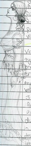
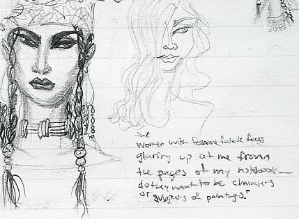
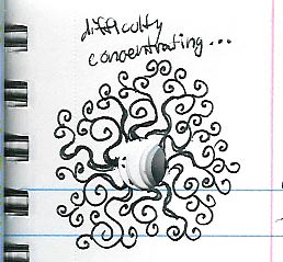
Just like the sitcom babies who always seem to be born when their mothers are in confined spaces with no hope of getting the aid of a trained midwife or obstetrician, my ideas also seem to come at inopportune times. Like when I am in the middle of a class.


This has been true since kindergarten. Unfortunately, it meant that a great many of my early masterpieces were confiscated by the authorities and mailed home to my mother with a note: "Tiffany drew this in class when she was supposed to be reading." Eventually, I learned to conceal this habit by drawing in the margins.

I like to think of what I do as a form of creative multitasking.
I was taking notes in microbiology class when the drawing above came to mind.


And this one is from a fiction writing class. You can even see some of the story there, a parody of Kafka's "The Nose" featuring a crooked televangelist who experiences an unusual form of divine retribution. I need to finish that story someday. It could be really funny.
And if you think I only draw while in classes when I lose interest, take a look at these samples from design school:


nothing to do with architecture


nothing to do with Rothko


completely unrelated to Carl André
(but she got her hairstyle from Frida Kahlo)


and this has nothing to do with Jasper Johns.


doodle 2004 Ancient Romans
But the Ancient Roman people above actually were drawn on the day we covered Ancient Rome in my art history class.


doodle 2004 art history class


But she's got little in common with Art Nouveau.


Still, what a great outfit! I doubt I'd have drawn something quite as well if I had put it off until the lecture was over. Really that's what drives these drawings, a sense of urgency, and a compulsion to draw. I am still listening, but I can't just sit still and listen. I have to draw while I listen. And I am always surprised at what comes out of the stray lines in the margins of a notebook.

doodle 2006 reminds me of Island of the Blue Dolphins


glamour girls and smoky eye


And really, that's the reason I save my notebooks. Not for the notes, but for the doodles.

I must confess, I even have done them while taking notes in meetings. I really liked that little tableau in the design center and wanted to capture it.


Still, I've never been entirely certain of what they all mean. As I wrote on the drawing above,

Women with femme fatale faces glaring up at me from the pages of my notebook— do they want to be characters or subjects of paintings?


Maybe they can be both.