The first step of making your own book with the software is to relax. So take a deep breath. Next, make sure that you have something to eat. This is a long process. You may want to order a pizza or something before you get started. Making a book with this software may involve locking yourself in a room with your laptop, so make sure you have some provisions. Next, remind yourself of why you wanted to make a book in the first place. Books are magical. Never forget that. Here is some classic edutainment from the 80's to remind you. Go ahead, watch this little video. I'll wait.
I hope that Jem and the Starlight Girls inspired you to open a book. Because that's the next step in this process. Open your book in BookSmart to get started.
CHOOSE YOUR FONTS WISELY
I'm not a graphic designer, but I collect interesting fonts. I spent a long time going through the vast collection at MyFonts.com, choosing the perfect typeface for the body of the book. And then when it came time to create my book in BookSmart, I couldn't use any of the fonts I bought. Oddly enough, it allowed me to use Darling Nikki, a font I downloaded for free in the late 90's. (Now you have to pay for it.)
But none of the fonts I paid for were acceptable. What a waste of money!
In frustration, I looked up my problem on the Blurb site and discovered that my best option was to choose a free Google font that was licensed for eBook use as well. You can find those here:
https://support.blurb.com/entries/22885903?locale=1
I chose Quicksand for the body of both of my new books.
MAKE YOUR COVER IN ANOTHER PROGRAM
Because your choice of fonts is so limited, you are better off making your cover in a program like Photoshop. Just be sure to make it high resolution (300 dpi) and size it to the exact dimensions that BookSmart recommends. Avoid putting any text near the edges. It will probably get cut off. Also, choose a font that has impact. Don't use something like Arial or Times New Roman. They don't have enough presence to work well for a book title. They're better for subtitles or for the body of the book. Bad covers make your book look generic and amateurish. If you're doing an art book, the good news is that you already have a treasure trove of great images to use for a cover. For my covers, I chose images that had enough space to put a title over them without the letters getting lost in a lot of details.
ADDING WORDS
Before you enter any text into your book, make sure that you have already written and proofed it in a word-processing program. You do not want to edit your text in BookSmart. Just don't. The laws of cursor physics do not seem to apply in this program. Fonts get changed, text gets moved, and then the program will say that there is a text overflow issue, and it will crash, and you may lose the edits you just made (even though it claims to have auto-saved it).
 |
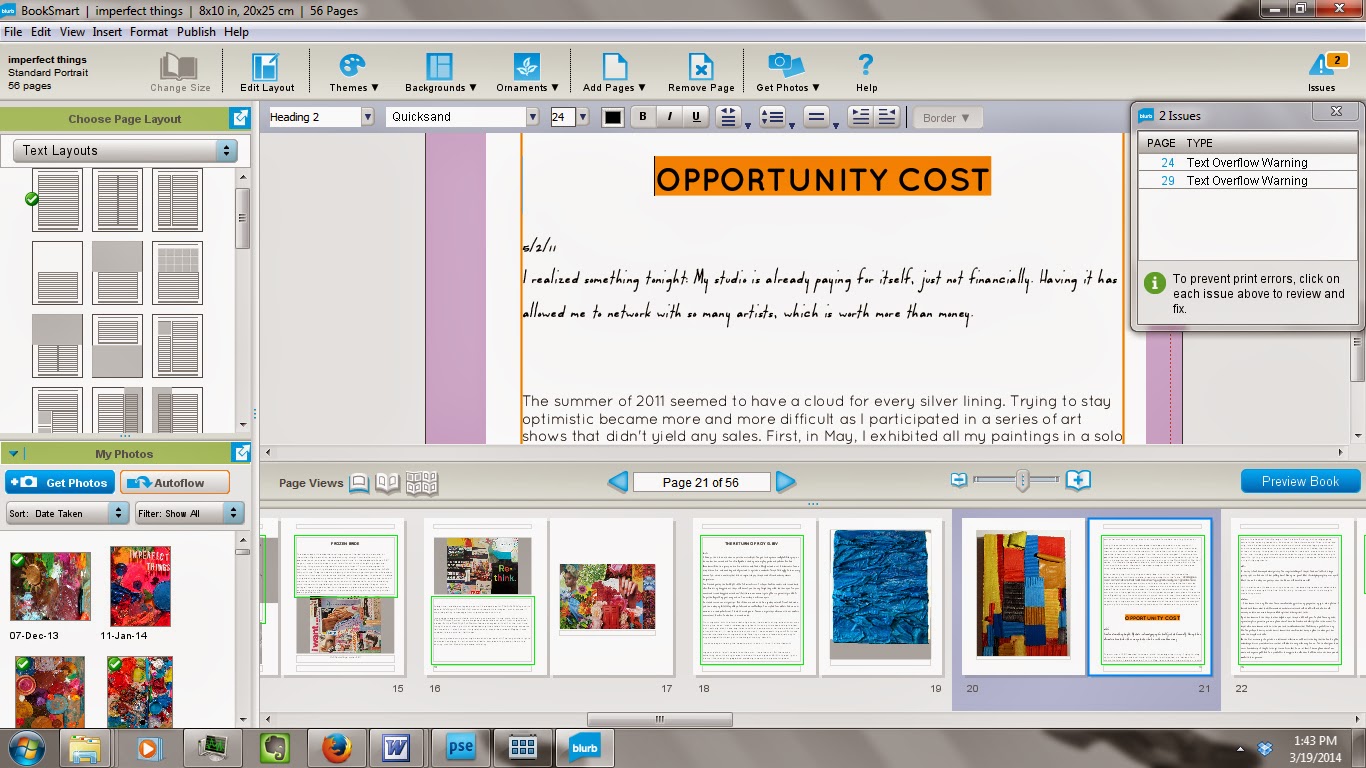
| Two text overflow warnings = a disaster waiting to happen... |
Avoiding text overflow issues must become your first priority. Think of it like a video game. Once you have 3 text overflow warnings, BookSmart is probably going to crash. So try to make sure that doesn't happen. The difficulty of this task will depend on the kind of book you're creating.
Here are my 2 examples. First, Imperfect Things. It is a book that consists of one long passage of text with some images added. And that's why it is a text overflow nightmare. I cannot begin to tell you how many times it crashed on me because of this. In frustration, I selected all the text and deleted it from the book. Then I went back into Microsoft Word, formatted all of the text (because I use two different body text fonts in the book), selected all of it, copied it, and pasted it back in. This approach worked fairly well, though there was one problem: the italicized formatting I used for the titles of my paintings did not copy over from the Word document. Not sure why this is, not sure what workaround there is for such a thing, but do keep this in mind if your project relies on italics, bold, or underlining. You may have to go back and make changes. And making these changes could lead to text overflow warnings, and crashes. So what you need to do is close the book every time you make a major change. This way, you know your changes will actually be saved.
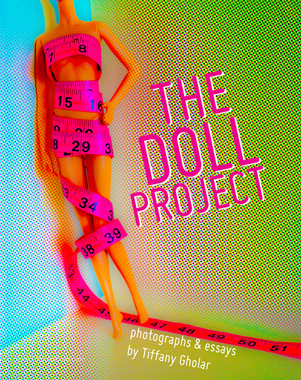
Now my second example, The Doll Project, is a series of short essays. I copied and pasted each one separately. Doing this spared me the trauma of text overflow warnings. BookSmart, it appears, is better at working with this format. No stress, no drama, no crashes.
lesson review:
- Do your editing and formatting in a word processing program first. Do not write your book in BookSmart.
- Once you get 2 text overflow warnings, close your book and reopen it.
- Consider writing a series of chapters instead of one long book.
ADDING PICTURES
Blurb BookSmart is great with pictures. It's actually better with pictures than it is with words. The variety of layout options for images is proof of that.
However, there is one picture layout that it's lacking: this one.
If you want to have a long passage of text above some smaller images, you have to create that layout yourself. I recommend this simple hack. Press enter several times to create a patch of white space from the end of your block of text to the bottom of the page. Then change the layout and add an image box behind your text box.
This solution is a little weird and imprecise and changing font sizes will affect the amount of white space you've opened up for your image. That's why it's best not to create this layout until after all the other fonts in your document are the size you want them to be. Otherwise, guess what will happen? That's right, the text overflow warning of doom.
If you go to the trouble of creating a special layout, you might want to save it so that you can use it on other pages or in other books you create with BookSmart. There are 2 big problems with this, however. The first is that your special snowflake layout will not apply to flowing text. The second is that BookSmart might snub your request to save your special layout for reasons unknown. Fortunately, it does display the x and y coordinates of every text and image box, so that can help you duplicate your design.
lesson review:
- BookSmart likes pictures better than words
- The software provides every layout you can dream of except for flowing text above smaller pictures (and flowing text with images in the middle of the page)
- After all the work you do creating a special layout, BookSmart may or may not let you save it to use again on other pages or in other books. It's fussy and temperamental.
FINAL THOUGHTS
It's sad to see a company that makes such beautiful books code such terrible software. But that's the thing about free proprietary software, you pay for what you get, and you get what you pay for. As for me, depending on how well my books sell, I may purchase InDesign for the next ones. But in case I don't buy it, at least I know there are ways to get around BookSmart's irritating glitches.


No comments:
Post a Comment