Wednesday, December 31, 2008
My goals for 2009
1. Graduate with an M.A. in painting
2. Have a great graduate show and sell lots of paintings
3. Get my art and [interior] design business off the ground
4. Start my own website
5. Set up an Etsy store
That should keep me busy for the next 365 days.
What about you? What are your goals for 2009? If you have also listed your goals on your blog, feel free to link in your comment. Also, for those of you who have sold on Etsy, how do you like it? Any other recommendations?
Thursday, December 25, 2008
Merry Christmas!

Christmas 1984: the year I got the Barbie Townhouse. I'll always remember it as the Best Christmas Ever. And I hope Christmas 2008 will be the Best Christmas Ever for you. Merry Christmas!

Sunday, December 14, 2008
America for sale - cheap, 1989 [from the archives]

"America for sale - cheap" | 1989 | Ballpoint pen on paper
My first little piece of social commentary art. This is a sketchbook drawing I did when I was 10 years old. In case you can't read my wonderful handwriting, the helicopter pilot is saying, "Let's buy the Sears Tower" and the sign on the map of the US says "America for sale cheap."
I had overheard my parents discussing the sale of the Sears Tower. There was talk of a possible sale to foreign investors. Of course, now I realize I should have drawn the "for sale" sign on my home state of Illinois.

Friday, December 12, 2008
Thanks, Fuel My Blog!

So I am glad to get whatever recognition that I can. Thanks again!
Tuesday, December 9, 2008
Silver Belles
A theme running through this account of silver is that it was never solely a rich man's pleasure. Silver has a universal appeal and a powerful hold on the imagination; for century after century it was the necessary luxury.
--Philippa Glanville, Silver : History & Design
Now that I no longer work in retail, this time of the year seems much less dreadful. No longer do I spend 8 to 10 hours a day with several versions of the same holiday songs being burned into my consciousness. Honestly, between working in retail and singing in the chorus in elementary school, I feel like I know every word of every Christmas song. Just for once, I wish that people would distinguish between songs that are about Christmas and those that are actually just about winter. "Sleigh Ride," "Baby it's Cold Outside," "Let it Snow," "Winter Wonderland," "Marshmallow World" and "Jingle Bells" are not about Christmas. They are about winter. We could keep playing them until February or mid-March if we really wanted to. But I sometimes I feel like I'm the only one who actually listens to the lyrics.
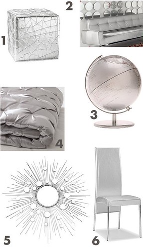
1. faceted metallic ottoman from Chiasso
2. Skyline sofa from Chiasso*
3. Silver Ocean Globe from Urban Outfitters
4. madison quilt + shams from West Elm
5. Starburst Wire Wall Mirror from Wrapables.com
6. Argent Dining Chair from Eurway
However, one drawback of metallic fabric is that you really need to see it in person. Photographs of it can be very misleading. And there are few fabrics more hideous or ghastly to the touch than poorly designed metallics. So if you see some silver furniture online or in a retailer's catalog, perhaps you can take a break to "test drive" it while you're out doing your holiday shopping. You can put your feet up on a silver ottoman while visions of a winter wonderland dance in your head.
*The Skyline sofa from might be discontinued, as I was unable to find it on their site. If you want it you should probably call to see if they still carry it. (The number is 1-877-CHIASSO )
Monday, December 8, 2008
20 One of A Kind artists
ART

Fabric works by Wycliffe (Linc) Bennett
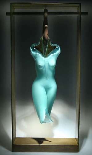
Glass figures by Noga Silk Art Glass

Paintings by Bekah Ash, who also sells apparel with her designs on it

Portraits by Chantal Baros

Cross-cultural pop art by Xiumei Zhang

Fabric sculptures by Martha Napier
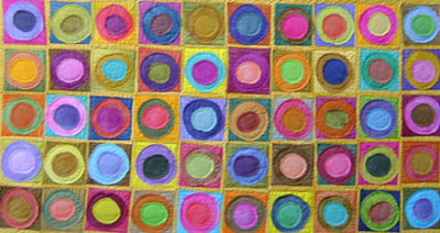
Textile art by Mimi Damrauer
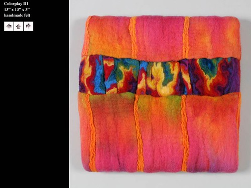
Sharron Parker makes amazing art pieces from felt.

Exquisitely detailed miniature trees by Paul-Andre Leblanc
HOME DECOR
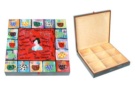
Hand-painted specialty boxes from Marilyn Grad, who also makes great wall art
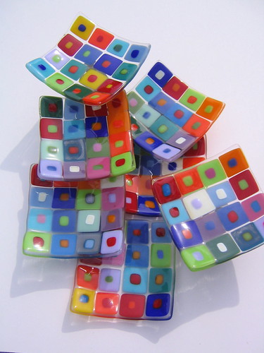
Case Island Glass sells these beautiful plates, as well as beautiful bracelets (I bought one last year)
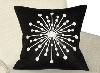
Great felt throw pillows from Jen Hopwood.
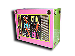
Though they're called AlbumCoverHandbags.com, they also sell home decor items, like this
FASHION
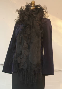
Silk wraps from Twist Wear

Incredible wool scarves from Marzena Gabrel Designs.
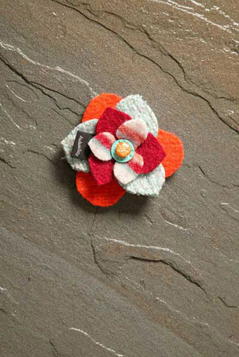
Recycled fabric flower pins by BaaBaaZuzu
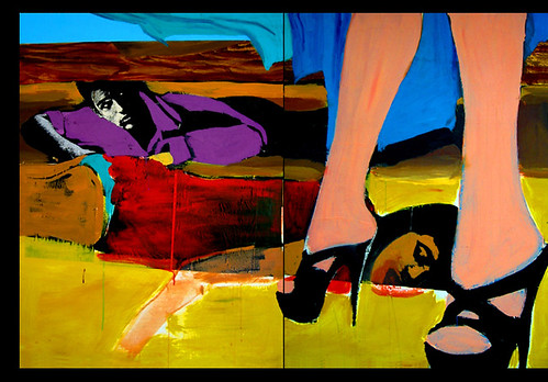
Sara Ryan's scenes of pop art intrigue
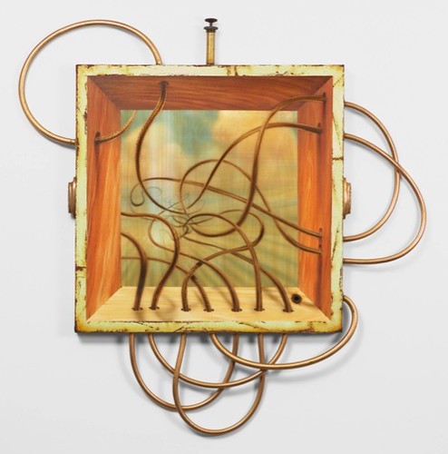
Jason Brammer's intriguing steampunk style Time Machine installation

The fine art drawings of Kris Jones, who even has a book of his work for sale.

Josh Harker's Knots & Tangles Sculptures

Friday, December 5, 2008
I'm on ArtSlant Chicago now

I just set up a profile on ArtSlant Chicago: http://www.artslant.com/global/artists/show/47168-tiffany-gholar It's supposed to be "A rich resource for the artist, the collector, the curator and the art lover."
We'll see.
I have signed up for so many free profile listings online that it's hard to keep track of them all!
Sunday, November 30, 2008
From the Archives: A Bitter Pill to Swallow illustrations, 1996-2000


So. I experimented. And sometimes, experiments fail.
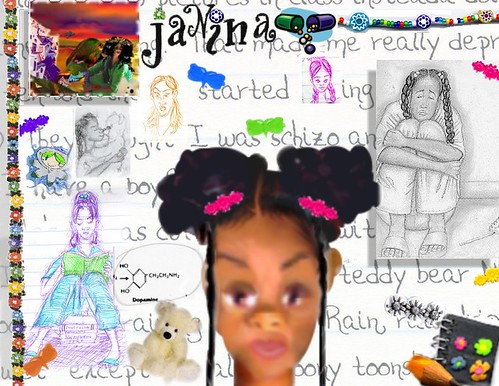
But I learned from my mistakes.
 After taking a class in web design, I thought about creating a web site for my novel. I still have a few illustrations I designed for it:
A Bitter Pill to Swallow is the story of two teenagers who meet under difficult circumstances.

After witnessing the drive-by shooting death of his friend Monica, 15 year old Devante develops post-traumatic stress disorder and attempts suicide.

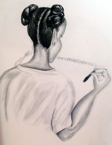

And there's also a weird little clip for a trailer I'd planned to make for it, designed in Kai's Power Goo:
If you're interested in reading excerpts from my novel, I'm sorry to say that I have no excerpts online right now. But I have posted two prequel short stories on my other blog. The first is entitled "A Little Fall of Rain" and the next one is called "A Reason to Die."
Thursday, November 27, 2008
Going Postal: new assemblage, "Priority Mail'

So many of the odds and ends I've been gathering for The Doll Project have come from eBay and Etsy. Many of them arrived via US Priority Mail. I saved the boxes to make this unpainted assemblage. "Priority Mail" is very dimensional. I love being able to make new pieces from the byproducts of other pieces. This way nothing is wasted.
Wednesday, November 26, 2008
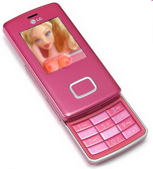
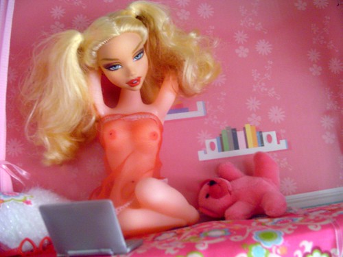
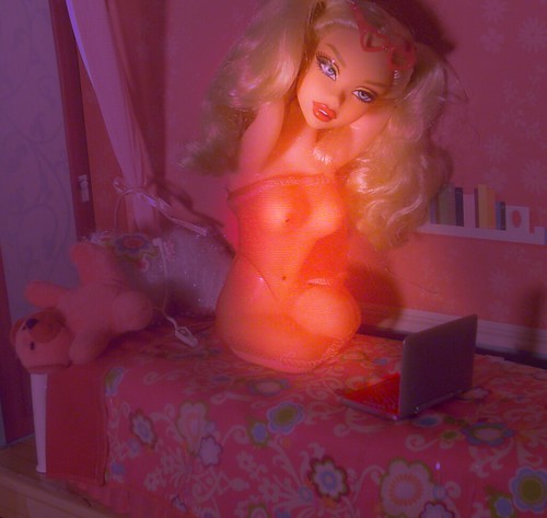
Yasmin, Kennedy, and Lolita: How Bratz and My Scene inspired the next part of The Doll Project


 Not to be outdone by this upstart toy company, Mattel introduced the My Scene girls. And I collected them, too.
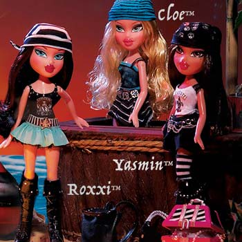
And Mattel, not to be outdone by MGA, tarted up the My Scene girls as well, most egregiously with the Bling Bling line.


I began to find more and more of Mattel and MGA's offerings offensive.
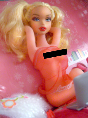
 I felt even worse for the little girls the dolls were marketed to. What kind of message were they getting? Of course, we cannot deny the link between Barbie dolls and pinup girls; Barbie herself is based on the German Lilli doll, a novelty item never intended to be a plaything for children. But for the most part fashion doll companies have reserved Lilli's modern-day counterparts for collectors. Case in point, the Mattel Silkstone lingerie collector series.
But this distinction was never made for the Bratz and My Scene dolls. In a world that markets thongs to first-graders, should I have even been surprised? In a world where the lines are so blurred that British superstore Tesco placed stripper poles in the toy department because they thought they belonged there, (probably next to the newer Bratz and My Scene dolls), I suppose this sort of thing was inevitable.


Even if that were the excuse their manufacturers chose to use, there is still the matter of appropriateness. But people seem less and less aware of that these days. Look at this example from Simon Doonan's Eccentric Glamour book where he writes about an encounter with a group of inappropriately dressed aspiring models:
These gals do not understand that clothes have meaning.
They were told to "dress to express," and that is what they did, randomly and without any sense that they might have the option top express something other than slutty availability or a general commitment to the porn industry. I feel bad for them. They are ill equipped to survive in the big city because they simply do not understand the significance of any of their fashion choices. Unless I intervene, these gals are doomed to go through life dressed like a bunch of third rate hoochie dancers, all the while thinking that they look perfectly normal and respectable.
Maybe I can be the one to open their eyes. I decide to give it a shot...
"Don't you see, your clothing, what you choose to wear every day, it speaks volumes about you. It is a form of communication! You have to make sure that your clothing is in sync with who you are."
From the puzzled looks on the faces of these attention junkies, I realize that this is a notion that has never ever ever occurred to them before. They are marching through the world, shopping, shopping, shopping, impulsively wearing all kinds of freaky ensembles, and never once have they stopped to think that fashion might be playing such a powerful role in all of our lives.
I continue:
"What you wear says everything about who you are. Long before you open your mouth, people are drawing conclusions about you based on your appearance. If you dress like a stripper, Carrie, people will assume that you are a stripper, which is okay only if you are in fact a stripper."
Popular media has become so fraught with double-entendres, double standards, and mixed messages that it is becoming more and more difficult to determine what is age-appropriate. It has led the of sexualization of girls. The American Psychological Association (APA), in their report on this very subject, says that sexualization occurs when
- a person’s value comes only from his or her sexual appeal or behavior, to the exclusion of other characteristics;
- a person is held to a standard that equates physical attractiveness (narrowly defined) with being sexy;
- a person is sexually objectified—that is, made into a thing for others’ sexual use, rather than seen as a person with the capacity for independent action and decision making; and/or
- sexuality is inappropriately imposed upon a person.

As for Bratz and My Scene dolls, the researchers say:
"Although these dolls may present no more sexualization of girls or women than is seen in MTV videos, it is worrisome when dolls designed specifically for 4- to 8-year-olds are associated with an objectified adult sexuality. The objectified sexuality presented by these dolls, as opposed to the healthy sexuality that develops as a normal part of adolescence, is limiting for adolescent girls, and even more so for the very young girls who represent the market for these dolls."
"related research suggests that viewing material that is sexually objectifying can contribute to body dissatisfaction, eating disorders, low self-esteem, depressive affect, and even physical health problems in high-school-aged girls and in young women."
"Psychological researchers have identified self-objectification (Fredrickson & Roberts, 1997; McKinley & Hyde, 1996) as a key process whereby girls learn to think of and treat their own bodies as objects of others’ desires. In self-objectification, girls internalize an observer’s perspective on their physical selves and learn to treat themselves as objects to be looked at and evaluated for their appearance.Though portraying oneself solely as a sexual object to be looked at is sometimes viewed by girls and women as exercising control over their sexuality (e.g., at some social networking Web sites), presentation of the self in this way can be viewed as a form of
self-objectification."
Related Reading:
LITTLE GIRLS: Pink, Purple & Bling from The Revolution of Real Women Blog
Hot Tots, and Moms Hot to Trot by Judith Warner
Study: Girls would rather be sexy than smart
Too sexy too soon?

