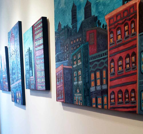
About a year ago, I shared a little bit of the
artwork I've created around a project I've been keeping under wraps, my YA novel. Now I'm going to let you in on a related top secret project I've been working on: the design for its cover. I do have experience designing my art book covers, though it was pretty easy. All I had to do was choose a good detail photo and a good font. I actually ended up using the same font on all three. Branding? Laziness? Trying to save money on fancy fonts? I suppose the decision to go with
Miso was the result of all 3 things.
But for my latest cover, the process was very different. This is a work of fiction. There were no pre-existing images for me to work with. I had to create them from scratch. But before that, I studied book covers. Rather than make a Pinterest board, I decided to create a folder in the cloud where I saved pictures of covers I liked. I looked at a variety of genres from many time periods, not just contemporary ones. Here are some of my favorites.
These are just a few of the covers I've added so far. If you want to see the rest of them,
click here.
Along the way I found some interesting similarities between some of the covers I like. By chance, the Lois Duncan reissued paperback cover ended up next to one for a book about artist
Man Ray, and I noticed that the women on the covers look alike.
The series of reprinted books by
Lizzie Skurnick looks great, by the way. I love the vintage feel.
I was also impressed by these series. Great branding. It makes you want to collect them.
I also noticed how some covers pay homage to designs that came before them, like this book cover that references an album cover.
Or this one that references an iconic poster.
Early on in the process, I decided to use an image that I would have to get permission to incorporate into my design. It's by
Charles Eames.
Then, I changed my mind after coming across a graphic I liked on some wrapping paper. It feels much more late 80's/early 90's, which fits with the era in which my novel is set.
I used it as an inspiration for my own design.
If the cover design has you wondering what my story is about (and I hope it does!) here is the blurb:
On the edge of the Chicago medical
district, the Harrison School for Exceptional Youth looks like a castle
in a snow globe. Janina has been there since she was ten years old, and
now she's fourteen. She feels so safe inside its walls that she's afraid
to leave.
Devante's parents bring him there after a
tragedy leaves him depressed and suicidal. Even though he's in a
different place, he can't escape the memories that come flooding back
when he least expects them.
Dr. Gail Thomas comes to work there after
quitting her medical residency.
Frustrated and on the verge of giving up on her dreams, she sees
becoming a counselor as her last chance to put her skills to the test.
When he founded the school, Dr. Lutkin designed its unique environment
to be a place that would change the students' lives. He works hard as the keeper of other people's secrets, though he never shares any of his own. But
everything changes late in the winter of 1994 when these four
characters' lives intersect in unexpected ways. None of them will ever
be the same.
Stay tuned for
the next installment, in which I will reveal the special edition covers I am working on for hardcover.