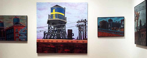
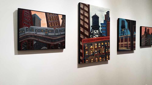
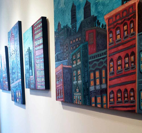
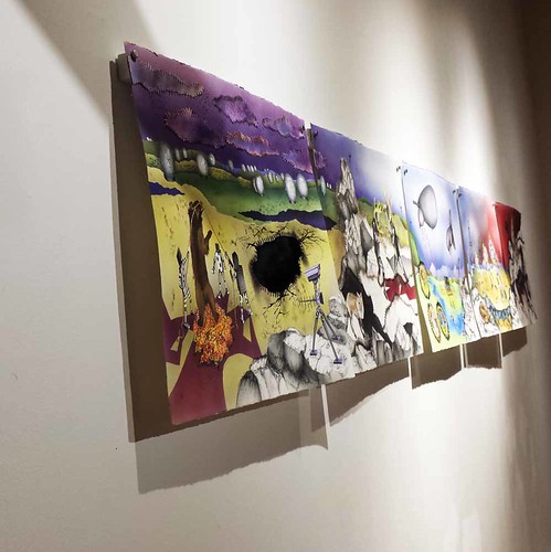
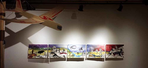
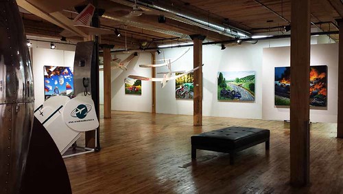
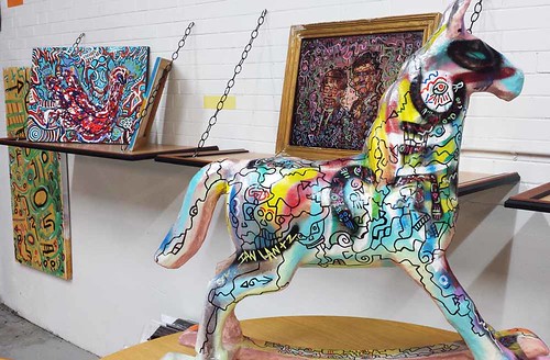
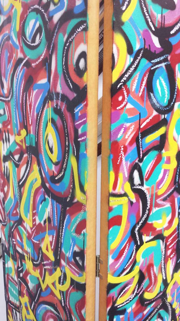
Fittingly, I made my way to my artist friend Kevin Swallow's show, This Must Be the Place, via El train. My commute there, as well as the walk I took beneath the new elevated park, reminded me of his rugged cityscapes. Water tanks, elevated train tracks, skyscrapers and power lines dominate his work.
It's urban, vibrant, and fun. The show will be at Firecat Projects until August 22nd.
Friday, July 24, 2015
Thursday, July 23, 2015
Judging books by their covers and learning from them
About a year ago, I shared a little bit of the artwork I've created around a project I've been keeping under wraps, my YA novel. Now I'm going to let you in on a related top secret project I've been working on: the design for its cover. I do have experience designing my art book covers, though it was pretty easy. All I had to do was choose a good detail photo and a good font. I actually ended up using the same font on all three. Branding? Laziness? Trying to save money on fancy fonts? I suppose the decision to go with Miso was the result of all 3 things.
But for my latest cover, the process was very different. This is a work of fiction. There were no pre-existing images for me to work with. I had to create them from scratch. But before that, I studied book covers. Rather than make a Pinterest board, I decided to create a folder in the cloud where I saved pictures of covers I liked. I looked at a variety of genres from many time periods, not just contemporary ones. Here are some of my favorites.
These are just a few of the covers I've added so far. If you want to see the rest of them, click here.
Along the way I found some interesting similarities between some of the covers I like. By chance, the Lois Duncan reissued paperback cover ended up next to one for a book about artist Man Ray, and I noticed that the women on the covers look alike.
The series of reprinted books by Lizzie Skurnick looks great, by the way. I love the vintage feel.
I was also impressed by these series. Great branding. It makes you want to collect them.
I also noticed how some covers pay homage to designs that came before them, like this book cover that references an album cover.
Or this one that references an iconic poster.
Early on in the process, I decided to use an image that I would have to get permission to incorporate into my design. It's by Charles Eames.
Then, I changed my mind after coming across a graphic I liked on some wrapping paper. It feels much more late 80's/early 90's, which fits with the era in which my novel is set.
I used it as an inspiration for my own design.
If the cover design has you wondering what my story is about (and I hope it does!) here is the blurb:
Stay tuned for the next installment, in which I will reveal the special edition covers I am working on for hardcover.
But for my latest cover, the process was very different. This is a work of fiction. There were no pre-existing images for me to work with. I had to create them from scratch. But before that, I studied book covers. Rather than make a Pinterest board, I decided to create a folder in the cloud where I saved pictures of covers I liked. I looked at a variety of genres from many time periods, not just contemporary ones. Here are some of my favorites.
These are just a few of the covers I've added so far. If you want to see the rest of them, click here.
Along the way I found some interesting similarities between some of the covers I like. By chance, the Lois Duncan reissued paperback cover ended up next to one for a book about artist Man Ray, and I noticed that the women on the covers look alike.
The series of reprinted books by Lizzie Skurnick looks great, by the way. I love the vintage feel.
I was also impressed by these series. Great branding. It makes you want to collect them.
 |
| This lovely image is from readthebloodybook.com |
I also noticed how some covers pay homage to designs that came before them, like this book cover that references an album cover.
Or this one that references an iconic poster.
Early on in the process, I decided to use an image that I would have to get permission to incorporate into my design. It's by Charles Eames.
Then, I changed my mind after coming across a graphic I liked on some wrapping paper. It feels much more late 80's/early 90's, which fits with the era in which my novel is set.
I used it as an inspiration for my own design.
If the cover design has you wondering what my story is about (and I hope it does!) here is the blurb:
On the edge of the Chicago medical district, the Harrison School for Exceptional Youth looks like a castle in a snow globe. Janina has been there since she was ten years old, and now she's fourteen. She feels so safe inside its walls that she's afraid to leave.
Devante's parents bring him there after a tragedy leaves him depressed and suicidal. Even though he's in a different place, he can't escape the memories that come flooding back when he least expects them.
Dr. Gail Thomas comes to work there after quitting her medical residency. Frustrated and on the verge of giving up on her dreams, she sees becoming a counselor as her last chance to put her skills to the test.
When he founded the school, Dr. Lutkin designed its unique environment to be a place that would change the students' lives. He works hard as the keeper of other people's secrets, though he never shares any of his own. But everything changes late in the winter of 1994 when these four characters' lives intersect in unexpected ways. None of them will ever be the same.
Stay tuned for the next installment, in which I will reveal the special edition covers I am working on for hardcover.
Labels:
A Bitter Pill to Swallow,
drawing,
inspiration,
process
Wednesday, July 22, 2015
New Zazzle Store, second time around
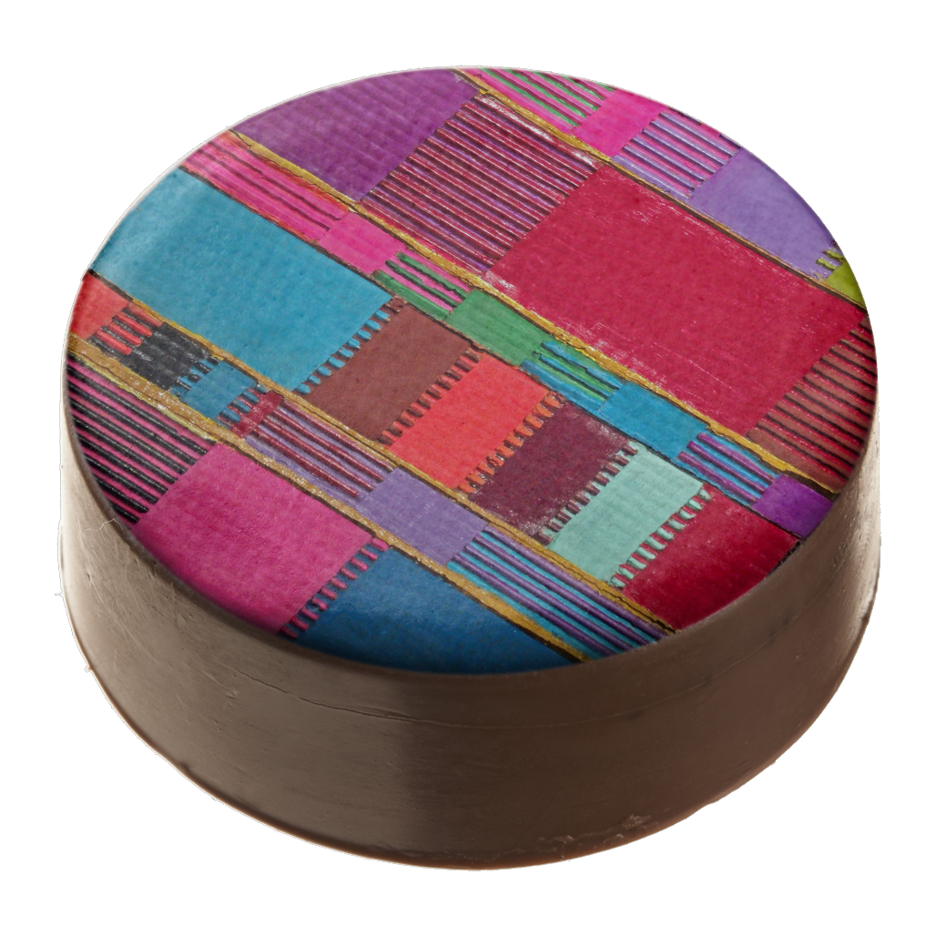
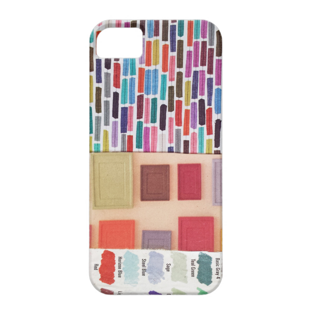
If you've been keeping up with this blog, you might have known about my first Zazzle store, which featured pictures from The Doll Project and, like a doomed love affair, ended far too soon. So while for now The Doll Project is going to remain exclusively on Society6, Zazzle has proven to be a great place for me to sell all sorts of products with my other artwork printed on them. The images below are just a small sample of what I offer. With over 700 items, I may have gone a little bit overboard, but at least I don't have to warehouse it all in my studio because it's print-on-demand!
It's a great option, whether you are looking to treat yourself to something nice or need a special gift for someone who might be difficult to shop for. And as far as I can tell, everything is manufactured here in the United States. See the full range of products in my store:
http://www.zazzle.com/mixedmediaartdesign
And if there is anything you'd like to see me add to my lineup, feel free to let me know in the comments.
Labels:
art,
digital art,
shameless self-promotion
Friday, July 17, 2015
A Hot Night in Bridgeport
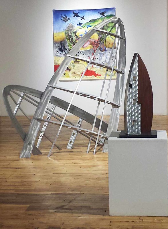
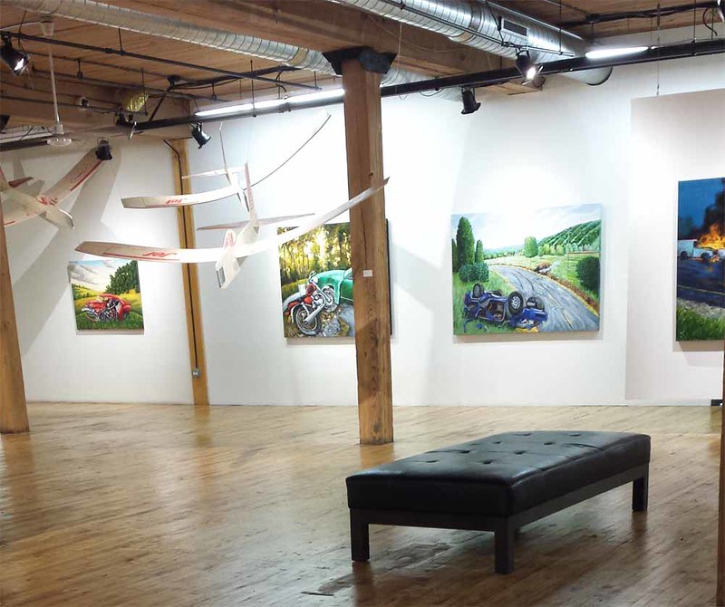
I spent a hot, muggy night visiting some art venues in Bridgeport. My first stop was the Throes of Progress show at the Bridgeport Art Center, which features work by my friend Kathy Weaver.
The show addresses difficult subject matter, including various accidents and tragedies. Many of the artists explore the ways in which technology endangers or fails us. The very notion of human progress is questioned in the face of human frailty and human error. The show continues through August 7th. See it if you can.
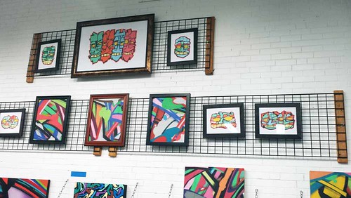
I also enjoyed seeing the Chicago's Best Abstract Muralists show at The Frame Shop. Lively and colorful work by several artists is featured in the gallery of this local framing shop.
The show addresses difficult subject matter, including various accidents and tragedies. Many of the artists explore the ways in which technology endangers or fails us. The very notion of human progress is questioned in the face of human frailty and human error. The show continues through August 7th. See it if you can.
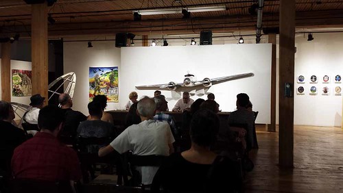 |
| The Throes of Progress artists talked about their work in a panel discussion. |
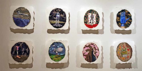 |
| I love this piece by Kathy Weaver, Artifacts of War. |
I also enjoyed seeing the Chicago's Best Abstract Muralists show at The Frame Shop. Lively and colorful work by several artists is featured in the gallery of this local framing shop.
Labels:
art,
events exhibits and shows,
other artists,
painting
Monday, July 6, 2015
My new Zazzle store
I had been thinking about doing this for months, and finally did it yesterday: creating a new store on Zazzle! Now you can get prints from The Doll Project in a wider range of styles and on an even greater variety of products.
I am so happy to be able to sell the You Are Beautiful Too! shirts in additional sizes, including maternity and plus sizes, because after all, that's what the message is all about.
See everything I have to offer at this link:
http://www.zazzle.com/thedollproject
UPDATE, 7/10
If you liked what I had to offer, you should have bought it yesterday. Zazzle has decided to delete all my images with Barbies on them because of their annoying policies regarding trademarks. Imagine where we'd be if Andy Warhol got in trouble with Campbell's soup or Brillo pads. I am really disappointed because I put a lot of time and effort into creating my new products and was really excited about having another possible stream of income. At least I can still sell my work on Society6. Hopefully they will keep adding interesting new products for us to print our images on. If you're interested, here's the e-mail Zazzle sent me:
Subscribe to:
Comments (Atom)
