 |
| Confluence | 36" x 36" | acrylic on polyethylene and paper on wood board |
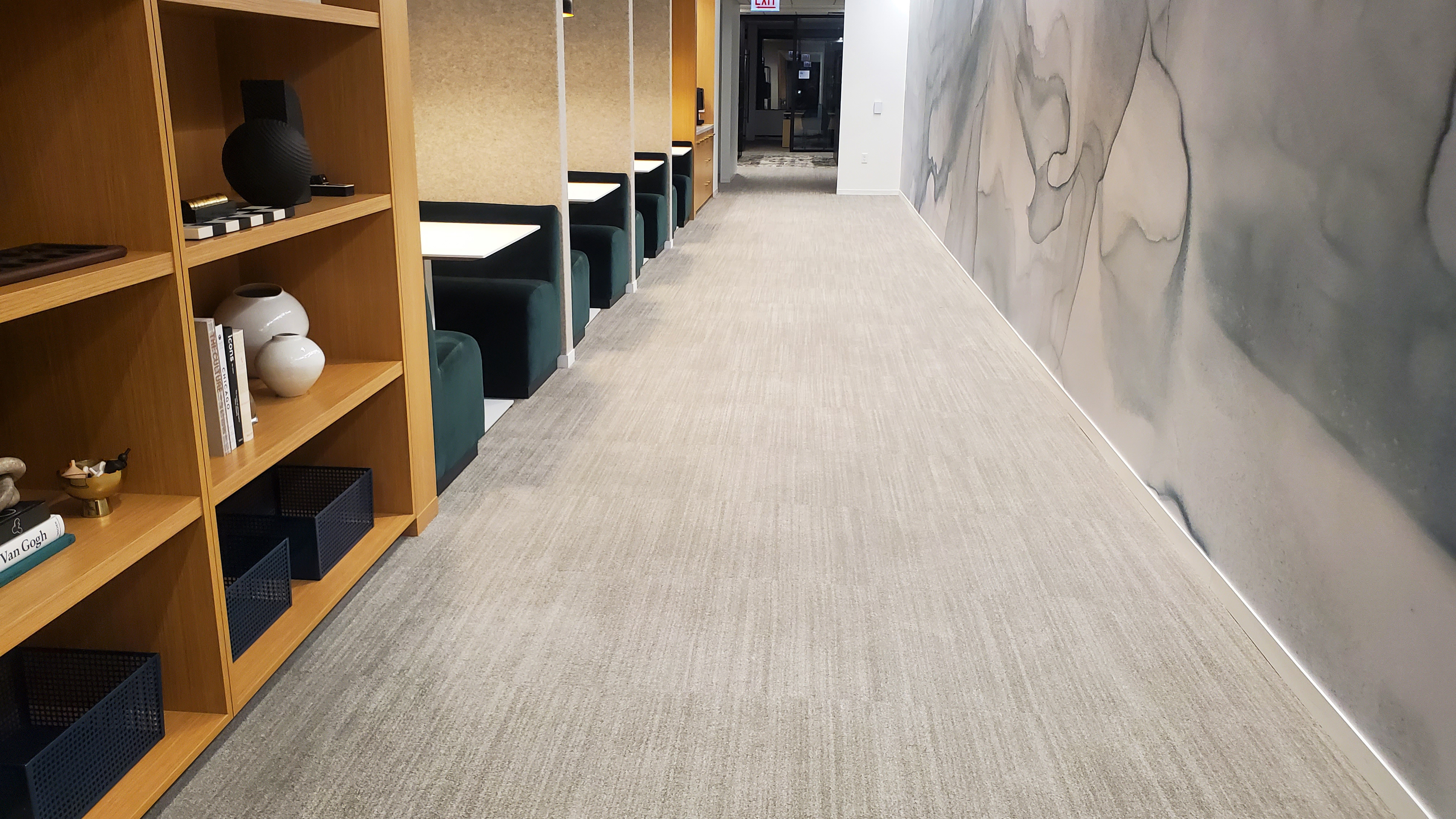
My latest commissioned painting was made for an office, my company's office, actually. We just moved to a new space that is close to the Chicago River. Our new color scheme reflects that. The wall that was designated for hanging the painting is almost a square shape, and the shape of the painting follows suit. The square shape needed diagonal waves to create a sense of movement. They are also in keeping with the river theme.
I scanned my favorite concept into the computer and used Photopea, a free web-based Photoshop alternative, to tweak the colors and enhance the highlights and shadows.
I used some of the polyethylene foam sheets and Kraft paper that I'd been saving to create a wavy surface. I didn't follow my sketch like a blueprint. Instead, I improvised.
After spending some time in the new office space, I decided to use richer, deeper shades of teal and green that better reflect the new furniture, finishes, and accessories.
 |
| the edge of a glass door in the office |
While working on my painting, I watched Geoffrey Baer's Chicago River Tour, a documentary produced by our local PBS station, WTTW. That was what inspired the title. "Confluence" is an area where rivers meet, and the word felt fitting.
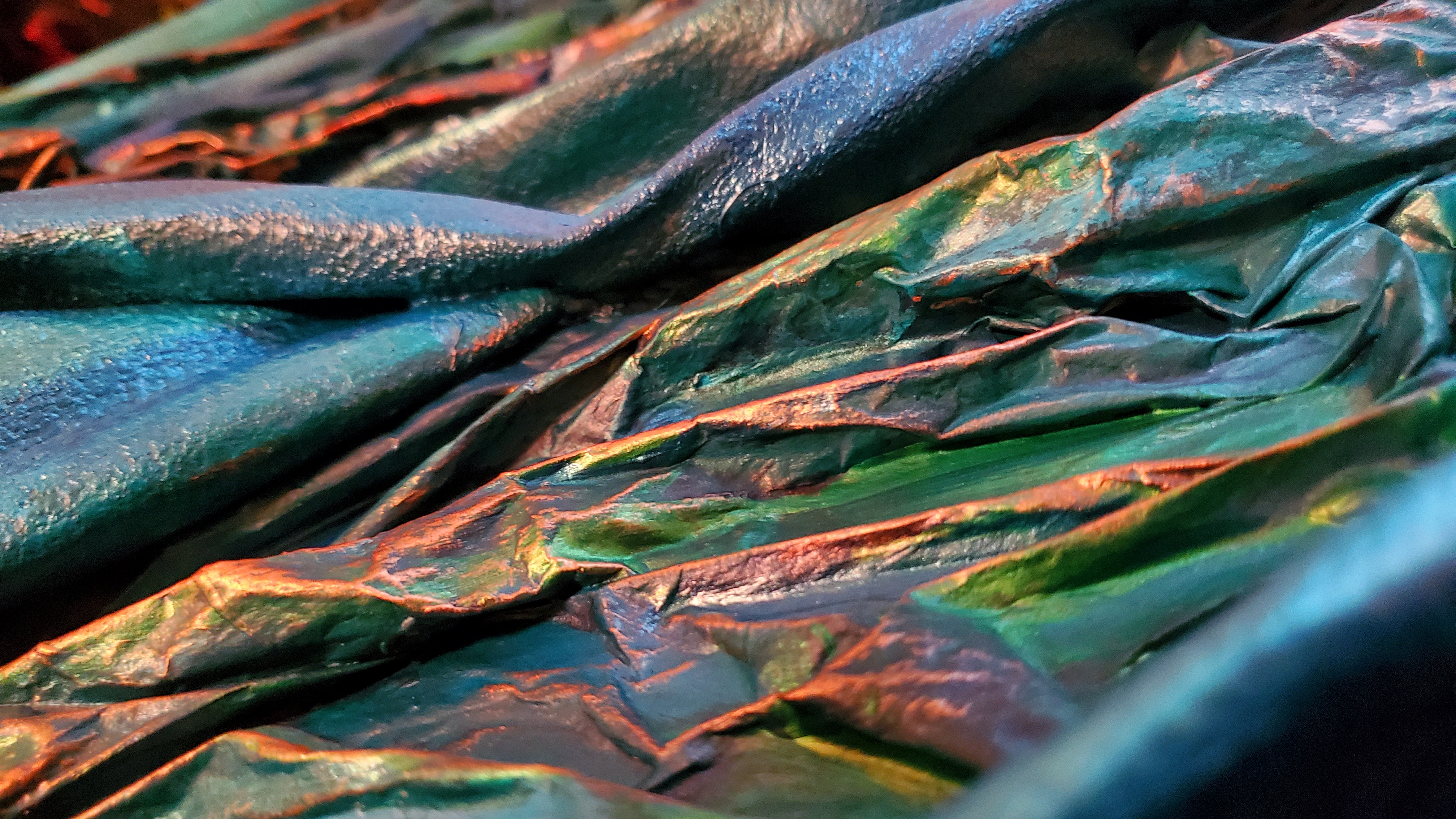
Here are some detail shots that give you a closer look at the texture and color variations. There are a few different shades of metallic teal, as well as emerald and copper.
I really enjoyed creating this commission and would love to do more custom pieces for anyone who's interested. I am so grateful to have had the opportunity to make one last big painting before the end of the year.


No comments:
Post a Comment