As always, there was so much beautiful furniture to see. I want to begin with some of my favorite color schemes.
I'm starting with this sofa from Krug because it's basically the same color as the new painting that I'm working on right now.
See what I mean?
I love this palette from Buzzi Space. They printed this photo on their tote bags as well.
My favorite color scheme was in the Arc-Com Fabrics showroom. What they did to highlight their new Nomad upholstery fabric collection was exquisite. The colors look so amazing together.
This is a fun conference room in the Scandinavian Spaces showroom. Such fun wallpaper!
I loved the use of jewel tones in the Global Furniture showroom.
Arcadia's color palette and motif are taken from a popular Marimekko floral print.
Offices to Go is Global's quick ship line of products. Their booth was very vibrant.
A good use of neutrals in the Momentum Textiles showroom:
Deep, moody neutrals in the Jean de Merry showroom:
Here are some individual pieces that impressed me.
 |
| Nucraft conference table |
 |
| KI seating and bookcase for a school or library |
 |
| Trinity chairs |
 |
| Peter Pepper Products table |
 |
| Andreu World sectionals |
 |
| award-winning Nienkämper heartbeat sofa by Karim Rashid |
 |
| Okamura sofa |
 |
| Green Hides hair on hide leather |
 |
| Sossego armchairs |
 |
| a rug from the Teknion showroom |
 |
| banquette seating by Martin Brattrud |
 |
| a felt space by De Vorm |
 |
| Naughtone |
 |
| Decca Contract |
 |
| Steelcase coffee table |
 |
| Steelcase panel |
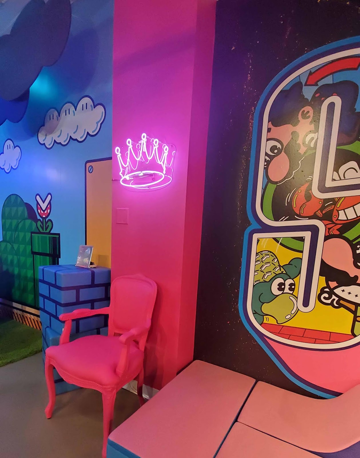
The most fun I had in a showroom was at SIXINCH. I was not expecting to find an arcade with one of my favorite video games from my early teens at NeoCon of all places, but they had Street Fighter II there!
And the decor reminded me of the arcades where I spent time with my brother, cousins, and friends when we were kids in the 80s and 90s.
I had so much fun playing Street Fighter II as Chun Li, my favorite character, that I lost track of time.
Another fun experience was the outdoor plaza by the river that Gensler, Haworth, and Janus Et Cie collaborated on.
Hanging out in the Janus et Cie pivot swivel daybed really made my staycation feel like a vacation. Nook was also back this year with more NookPods to relax and recharge in, and this time they came in additional configurations.
I love it when showrooms have creative displays, like this one from EF Contract.
Andreu World did a good job showing off their color palettes, inspired by the Mediterranean.
Every year, Luna Textiles makes something new with their upholstery fabric. This year, they made kilts.
There were more displays in the main floor lobby. I took these pictures the Saturday before NeoCon when I came to pick up my badge in advance.
 |
| Sossego |
 |
| Pedrali |
Herman Miller made this clever display that reminds me of a shadowbox.
Hightower has a new showroom with beautiful arches in its interior architecture.
Their refreshments coordinated perfectly with their decor. The terrazzo counter top is from Concrete Collaborative.
Great modern wall art in the Nucraft showroom.
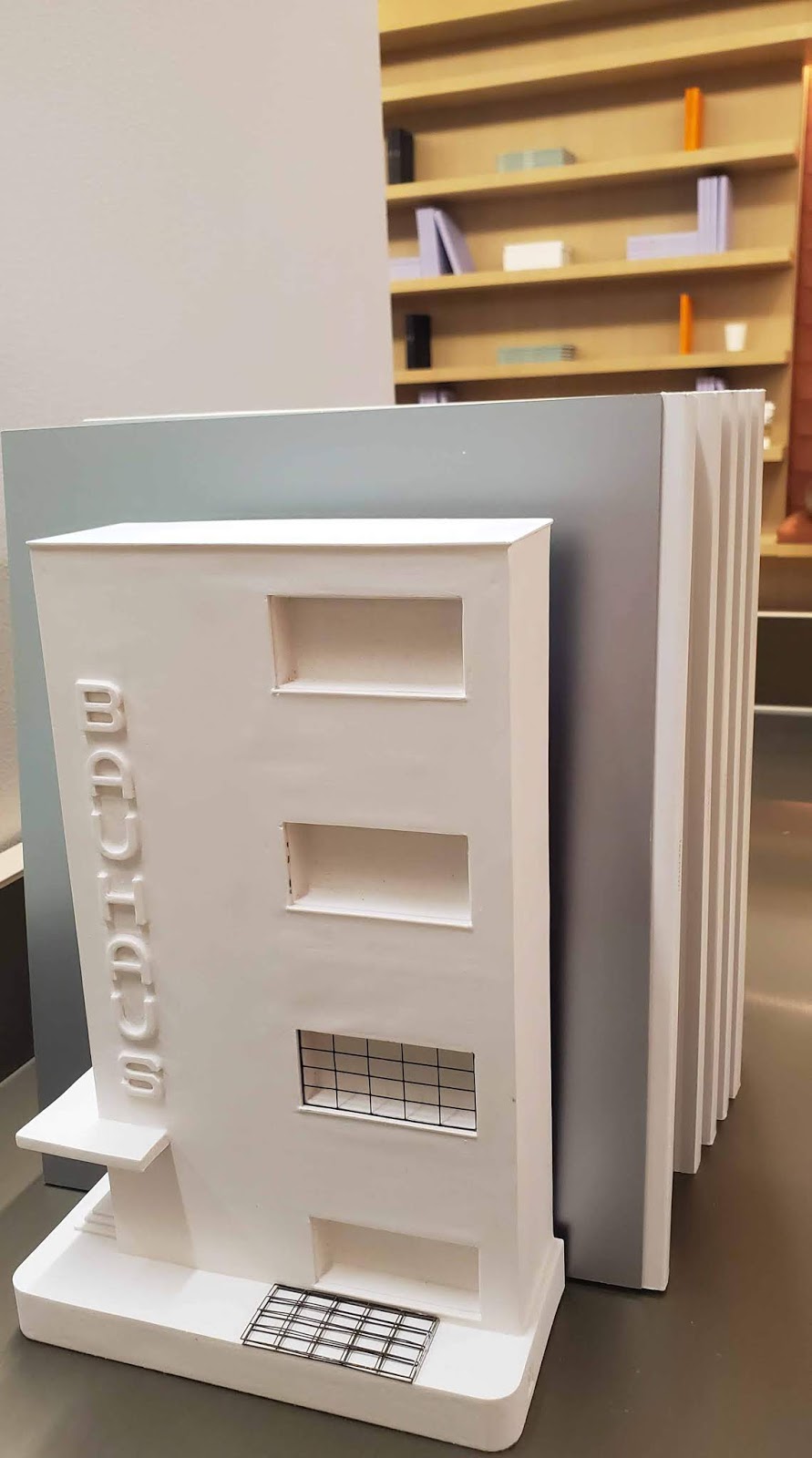
Some Bauhaus references at Teknion and Designtex:
I noticed a lot of interesting statements on the showroom walls this year. Some reminded me of artists statements, while others were simply profound.
But if color is a state of mind, what were some of the designers thinking when they came up with some of the atrocious color palettes I saw this year?
There are so many colors we can use.
Just look at them. The brilliance. The splendor.
Each one like a unique flavor or musical note.
But just like musical notes or flavors, not all of them work well together. Yet time and time again I saw ill-considered color palettes of hues that were forced together to create an unsettling visual dissonance. Honestly, those designs would have looked better in grayscale or black and white rather than in the hot colors of the year shoehorned into a palette where they don't belong. Anyway, I don't like to waste time writing about interior designs that I don't like. I'd rather feature things that I like on here. I'll end on a positive note and feature all the beautiful plants and flowers I noticed in the showrooms this year.
This year my favorite tote bag came from Scandinavian Spaces. It goes so well with my studio colors!
As you can see, I had a great time. Also, this was the first year that I didn't bring my DSLR camera with me to shoot. I'm really happy that the pictures I took with my new Galaxy S10 were sufficient. It's the first time I've had a smartphone that actually lives up to what they say about it in the ads. If you want to see all the pictures (almost 300!) I took at NeoCon this year, take a look at my Flickr album.
Spending three consecutive days immersed in design always gives me a lot to think about. This year, I have been focusing a lot of energy on trying to get new clients, and going to NeoCon makes me want to start on a new project even more. I still haven't figured out a way to make a living doing what I love, but I feel like when the time comes, I will be prepared because I have learned so much from attending NeoCon and other trade shows year after year.


No comments:
Post a Comment